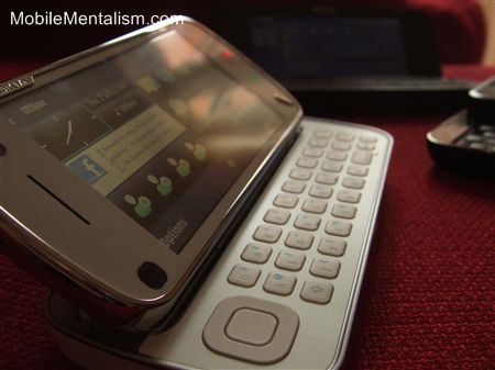
Here it is at last, my full hands-on Nokia N97 review. I'll give you the low-down on the good and points of the N97, as well as how well it works as a smartphone (which I'm in a good position to assess, having owned a Nokia E90 and now a T-Mobile G1). You might be surprised by the answer!
Full hands-on Nokia N97 review after the jump.
Nokia N97 overview
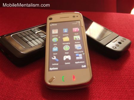
The Nokia N97 is Nokia's first touchscreen smartphone, and so draws natural cries of "iPhone killer". It's a neat-looking smartphone with 3.5" screen, few exterior controls, and a great slide-out keyboard. On the back is the obligatory camera (a 5 megapixel one with Carl Zeiss optics), while just three buttons grace the front. Most of the phone's features are controlled by the touchscreen.
Yup, certainly seems like it's meant as an iPhone killer!
Anyone who's bought a Nokia N-Series (or even an E90 for that matter) later than the N95 should be familiar with the list of features. Five megapixel camera, aGPS, HSDPA, Wi-Fi - all the usual features that you'd expect are there. This is a good feature-set, but it's not exactly great. Like I say, it's pretty much what you got with the N95 and every N-Series phone since, and certainly what you get with most Android phones.
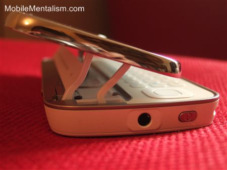
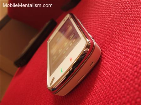
As far as looks are concerned, it's quite good looking, and certainly got a few 'wows' of appreciation from my mates. In particular, the slide out keyboard raised a few eyebrows. One thing I have to say, though, is that it really doesn't suit white.
As far as build quality is concerned, it feels less sturdy than the E90, with the back plastic cover in particular feeling like it'll snap after just a couple of times of taking it off. The phone itself does feel suitably weighty, though, without feeling too heavy, and fits into the pocket nicely.
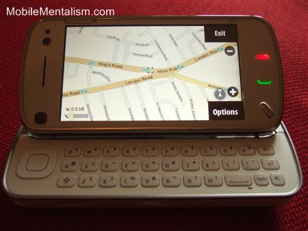
Finally, the keyboard. It takes a bit of getting used to, as it's not your conventional layout (the space bar is off to one side, for example), but it's quite good, although not as good as the E90. The keys aren't as tactile as the G1's, but they work well enough, and without the G1's chin to get in the way, typing is actually far more comfortable.
Nokia N97 Review in depth - does it work as a smartphone?
Smartphones these days can be broken down into three key sections:
- Web integration
- Features
- User interface and experience
How well the phone scores on these three aspects tends to determine how well it works as a smartphone. So let's see how well the N97 fares.
Nokia N97 Web integration
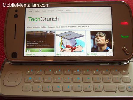
The Nokia N97 is a phone with a huge touchscreen, super speedy connectivity, and great Internet connectivity - perfect for browsing the mobile Web, then. Indeed, when I buy a smartphone, it's the Web experience that I particularly look out for. How well and how fast the Web page renders, how easy it is to navigate around the screen and the whole site, and the phone's integration with other Web apps are just some of the things I look out for.
As far as the N97 is concerned, it's a mixed bag. Once a Web page has finished loading, it's rendered very well. TechCrunch, for example, contains some heavy Web pages, at over 1MB per page. It's long on content, particularly text, that can be tricky to read unless the screen and the browser are up to the job.
Fortunately on the N97 they both are, and Web sites are rendered really well. There are, however, two rather large buts:
- The Web browser is a version of Web Kit (i.e. the same browser that Apple's Safari and Google Chrome use), and although good, is exactly the same browser Nokia have been using since the N95. As such, it's virtually identical to the browser used in the E90, which has been in use for at least the past two years.
- Navigating around individual Web pages is a nightmare! The touchscreen is too sensitive in places, leading to accidental clicks on links that suddenly take you to places you don't want to go to. Equally annoying, scrolling down through a Web page is much too difficult, as the touchscreen sometimes doesn't realize it's being scrolled, and most of the time lags behind your finger's swipe. The result is frustration, sometimes leading to the use of the cursor control button to manually scroll up and down the page, which kind of defeats the point of a touchscreen!
There's another little niggle as well - the user interface is clunky, unattractive and inconsistent, as you can see below with the menu that pops up. Now this is a subjective thing, and more than one of my friends liked the menus as they made it easy to navigate around. Personally, though, I hated the interface, and compared ot the iPhone, Android or Palm Pre, it's just embarrassing!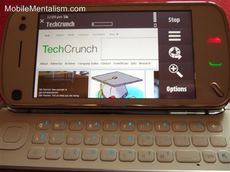
All in all, then, the N97's browsing capabilities are frustrating. They're OK, being on a par with the E90, but they're no match for the iPhone, Palm Pre, or Android.
Nokia N97's Features
Nokia normally excel with their phones' features, and the N97 is no different. Here's a run-down of the key features you'll find.
N97's camera
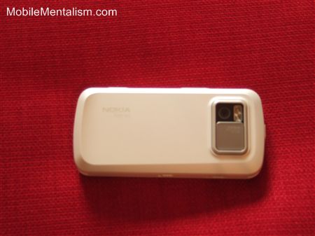
The N97 boasts a five megapixel camera with Carl Zeiss optics, auto-focus and dual-LED flash, which should give you the hardware quality you need for great pics. This puts the N97 towards the top of the smartphones in terms of camera abilities.
Better still, you can access the camera's features via the touchscreen while seeing the picture you're about to take. Not only acn settings such as white balance, exposure, contrast, etc., all be changed easily from the touchscreen, but you see the effect that each change in setting has in real time as the image you're about to take a photo of is displayed side by side with the setting options.
This makes the N97 supremely easy to take great pics and also a great way to learn about photography if you've never used a camera's more sophisticated features before. Learning from a book about white balance, ISO settings, etc., is one thing - seeing the changes they make in real time makes a world of difference.
The only downside to the camera on the N97 is the awkward touchscreen and Symbian OS - but more about this later.
N97's GPS and Maps feature

Like the majority of Nokia phones in the past couple of years, the Nokia N97 comes with aGPS built-in and Nokia Maps (powered by Nokia-owned Navteq) pre-installed. Also like the majority of Nokia phones, the aGPS takes an age to find a satellite when first in use (unlike my G1, which found one straight away), and Nokia Maps is still not as good as Google Maps.
Fortunately, Nokia Maps are actually usable in the N97, which, unlike the E90, has the power to drive the mapping application so that it's responsive to your commands. On the E90, changing location by scrolling took and absolute age - so long, in fact, that the mapping software became unusable in built-up locations such as London.
In contrast, the N97's maps move effortlessly as you swipe your fingers across the screen.
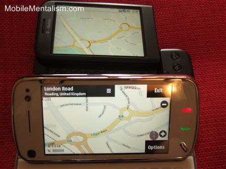
My only problem with Nokia's Mapping software is that it's not a patch on Google's - which is free, and which can be downloaded onto the N97 if you so wish (which was the first thing I did with my E90 when I realized it couldn't actually use Nokia's mapping software). Google's maps feel just so much more responsive and easier to read than Nokia's.
That said, having the maps themselves pre-loaded on your phone certainly helps when you're in a mobile black-spot. No coverage means no maps with Google, whereas with Nokia, you can still see where you're going. Google Maps is my mapping software of choice, then, but having an offline backup is more than welcome.
Just a shame Nokia spent billions buying NavTeq when its mapping software is only used as a backup!
Music on the Nokia N97
The Nokia N97 has an MP3 player that supports MP3, AAC, eAAC, eAAC+, and WMA formats, and comes complete with a 3.5mm standard headphone jack (oh, and headphones, too!).
That, however, is about all that can be said of it. The interface is so dull and uninspiring, it's almost like it was built back in the days of 8-bit computers! It's virtually all text. Compare this with the stunning visualizations of the new Sony Ericsson phones such as the Saito, and the N97 looks like a dinosaur!
Worryingly, this is symptomatic of the interface as a whole - clunky, boring and ugly.
Nokia N97's Video Functionality
Nokia's N-Series phones have always had good video features, and the N97 follows this tradition. With a video resolution of up to nHD or VGA at 30 fps, 16:9 widescreen shooting capability, and the ability to record 90 minutes of video on the N97's huge internal 32GB of memory, you'll certainly be in position to take great video should you be in the right place at the right (or wrong!) time.
One nagging doubt though - the video quality is the same as the E90's and a dozen other N-Series phones.
Hmmm, are you spotting a theme here?!
N97's user interface and user experience
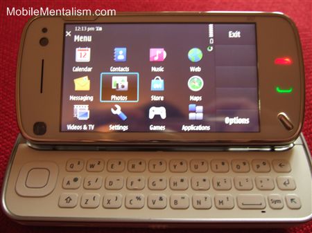
The final key feature of a smartphone is its user interface and user experience. This never used to be a problem, as they were all uniformly awful. The iPhone changed all that.
Since then we've had a plethora of Android devices, Windows Mobile 6.5, and the Palm Pre, plus some interesting Symbian-based UIs from the likes of Samsung and LG. In other words, it's not enough just to provide any old interface any more - your phone's interface and the overall user experience has to absolutely rock.
Which is a bit of a problem for the N97, as both its interface and the overall user experience sucks!
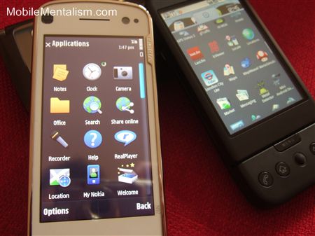
OK, maybe that's a bit harsh. Certainly it's better than the E90 - but that phone's over 2 years old, and isn't a competitor to the N97. The iPhone, Android and the dozens of other touchscreen phones are.
Touchscreen problems
I've already touched on the touchscreen's problems (as it were). The reason for this is the N97's use of resistive touchscreen technology, as opposed to capacitive technology used on the iPhone and Android. Capacitive is far more sensitive, and it shows.
Nokia haven't exactly helped matters, though, with their weak user interface. It's confused at best. To move a Web page down the screen, you put your finger on the top of the screen and swipe upwards. Fine. But then to scroll a list of icons down the screen, you put your finger on the screen and scroll downwards. Eh?
With the Web page, your finger is essentially moving the page itself. Thus, swipe up, and you're dragging the page upwards, letting you read what's on the bottom.
In contrast, with the list of icons, you're actually moving the screen's scroll bar, which obviously works in the exact opposite way. To say this is confusing is an understatement, as your mind has to make a mental check to remember which way the screen will scroll when you slide your fingers across it. Shouldn't user interfaces be intuitive? Isn't this kind of confusion exactly what interface designers have been trying to avoid since the 1980s?!
Super-ugly interface
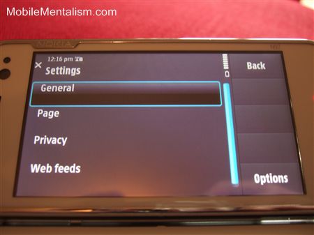
This nicely leads on to the other little niggle with the interface - it's unbelievably ugly! Symbian, it seems, does not play with touchscreens, at least not in the version that Nokia uses.
The E90's interface was stark and functional, but that was back in 2007, when it was allowed to be. It was also a business phone, so it could get away with a certain utilitarian feel.
The N97, though, has to be held to a higher level. All its competitors have great looking user interfaces. The N97, in contrast, has an ugly one that looks unfinished, text based, and almost devoid of any style. AFter using the G1 for some months, the N97's dullness actually comes as a shock. Nothing prevents the N97 from being an iPhone killer more than its poor interface.
Creaking Symbian
My final problem with the N97 is Symbian itself. As a mobile OS, it's been great - but it's starting to show its age amongst the competitors. The interface on the N97 is little different from 2 year old phones such as the E90. This is bad enough, but with the addition of a touchscreen, the Symbian interface just doesn't seem to work all that well.
The menus look clunky, either obscuring the screen or looking very different from the Web pages they overlay. The icons look dreadful and the response of the screen is poor.
Worse of all, though, is that the new mobile platforms, particularly the iPhone and Android, have a vast array of apps that they can tap into, each of which make the phone more interesting, more capable, or just plain more fun.
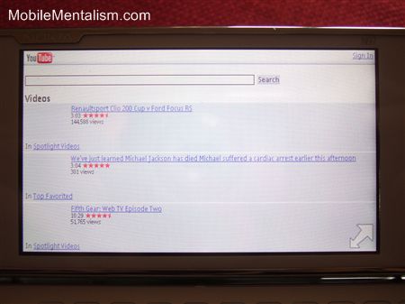
In contrast, the N97 is based on Symbian, and although it has apps, they're all very boring! The majority are business-oriented or utilitarian, reflecting the background of the OS. Although you get YouTube, Facebook and Twitter apps, they look like tacked-on mobile-specific versions of their Web equivalents that have been designed to work on an old WAP phone - not the super-slick apps that have been designed to work well and integrate with your Android or iPhone.
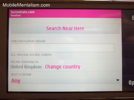
Take, for example, LastMinute's app (above). On the G1, it's a glorious thing, listing local restaurants, bars and places of interest on an interactive radar that you can click on and get directions for, which rotates as you rotate thanks to the G1's compass, and which uses an easy to use interface that makes maximum use of the G1's sensors and features.
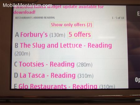
On the N97, it's a low-res mobile Web page that doesn't interact with the phone at all, except to get your current location, despite the N97 having the same GPS and compass features as the G1, . Very poor.
Whether this is due to the phone itself, or the app developer's lack of imagination is unclear. But if Nokia's to compete with the iPhone and Android, it needs apps that are at least as sexy as what you get on those platforms. And the one word that really does not describe Symbian in any sense is sexy.
Summary
You might think, then, that I'm quite down on the N97. That's not strictly true. I loved my E90, I love Nokia phones, and the N97 is not a bad phone. It's just not a great one, and it's certainly not great compared with the competition. Given that this is meant to be Nokia's flagship phone, it's a bit of a let-down, particularly when you think how great its previous flagships have been.
Some of my friends loved this phone, although they didn't spend as long with it as I did, and they also aren't smartphone owners. One friend who has a Nokia N95 loved it, feeling at ease with the Symbian interface as it's so familiar to him, and not bothered in the slightest about the lack of responsiveness of the interface. Quite what he'd say if given an iPhone or an Android phone is another matter though!
If you're happy with the E90 or N95, you'll love the N97, as it's like a touchscreen-based speeded-up smaller new version. Problem is, if you're used to the iPhone, Android, Palm Pre, or even Windows Mobile 6.5, you're going to be disappointed. It's almost like Nokia is using a roadmap that consists entirely of Nokia devices, each building upon the other, but paying no attention to the competition that's now encircling it. A dangerous strategy, particularly when there's now such intense competition in the smartphone market.
To sum up, then, the Nokia N97 is capable, functional and will do the jobs you could do with the E90. A great phone for 2007 - an ordinary one for 2009. Wait for it to come down in price would be my advice. I give it 6.5/10


No comments:
Post a Comment